
New Junat.net
A cleaner Junat.net interface for checking Finnish train departures, station boards and travel information more quickly.
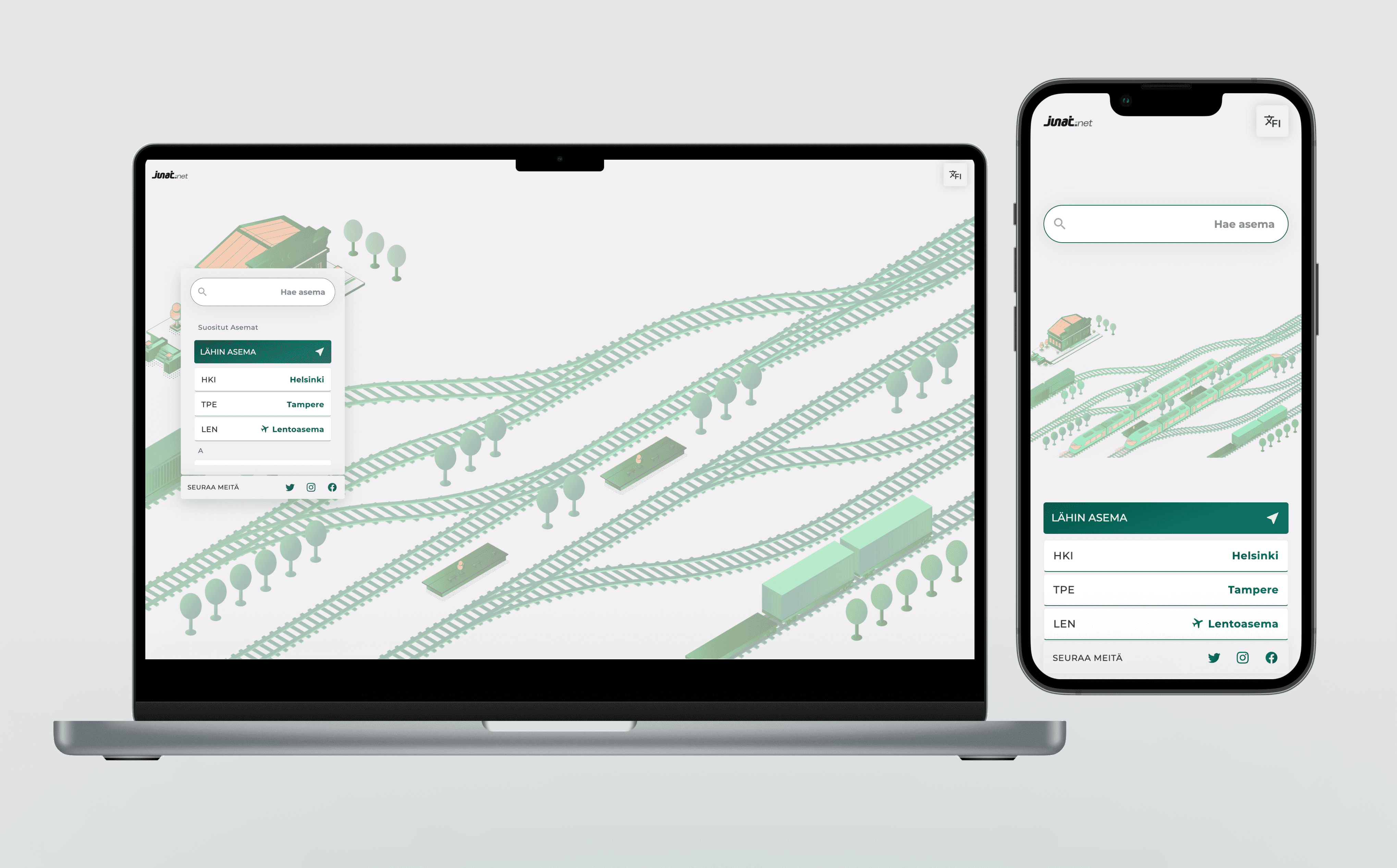
A cleaner way to check trains
Junat.net has been refreshed to make everyday train information easier to read and faster to reach. The update focuses on the moments people use the service most: checking a departure, opening a station board, comparing a route or finding the right travel page without thinking too much about navigation.
The goal is not to make the site feel louder. The goal is to make the important information feel calmer.
What changed
The interface has a clearer visual system, more consistent spacing and a simpler structure across the main travel pages. Train times, station names, routes and action buttons are easier to scan, especially on mobile.
The redesign also gives Junat.net a stronger foundation for new features. Station boards, train tracking, ticket search, airport schedules and flight search can now sit in the same product language instead of feeling like separate experiments.
Why it matters
Travel information is often checked under pressure. You may be walking to a platform, waiting at a station, checking a delay or comparing options before leaving home. In those moments, small interface decisions matter: text size, spacing, button placement, language switching and whether the page gives you the answer before it asks for attention.
The refreshed Junat.net is designed around that practical use.
What comes next
This release is a foundation. The next improvements continue in the same direction: better localized pages, clearer station and route content, stronger live train information, and booking flows that explain what a passenger is actually buying.
Junat.net will keep evolving around one principle: make Finnish rail and travel information easier to understand at the exact moment people need it.